
The Importance Of Typography In Web Design
Typography is more than just choosing fonts and arranging letters. In web design, it’s a powerful tool that can enhance readability, convey emotions, and create a unique brand identity. Understanding the principles of typography and how to apply them effectively can transform your website from ordinary to extraordinary. In this post, we’ll delve into the essentials of typography in web design, exploring its impact and offering practical tips for making the most of this vital design element.
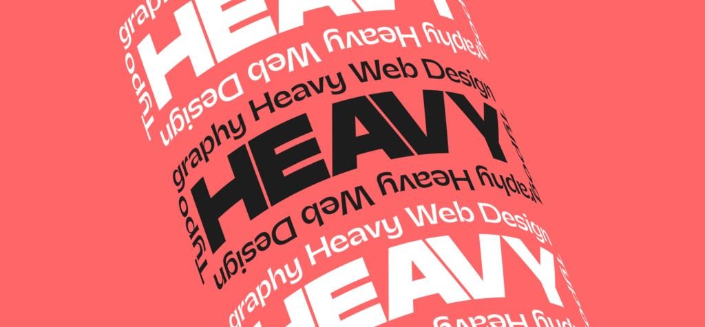
The Importance of Typography in Web Design
Typography plays a crucial role in web design for several reasons:
- Readability: The primary function of text on a website is to convey information. Good typography ensures that this information is easily readable, allowing users to absorb content without straining their eyes.
- User Experience: A well-chosen typeface can enhance the overall user experience, making navigation intuitive and enjoyable. Poor typography, on the other hand, can frustrate users and drive them away.
- Brand Identity: Typography is a key component of a brand’s visual identity. The right typeface can communicate a brand’s personality, values, and tone, helping to create a memorable and cohesive brand image.
- Aesthetic Appeal: Typography contributes significantly to the visual appeal of a website. It can create a sense of harmony and balance, making the site more attractive and engaging to users.
Key Principles of Typography
To effectively use typography in web design, it’s essential to understand some key principles:
- Font Selection
Choosing the right font is the first step in effective typography. Here are a few tips:
- Match the Mood: The font should reflect the mood and personality of the brand. For example, a law firm might choose a serif font to convey professionalism, while a creative agency might opt for a more playful and modern sans-serif font.
- Legibility: Ensure the font is easy to read, even in smaller sizes. Avoid overly decorative fonts for body text, as they can be hard to read.
- Versatility: Choose a font that offers a variety of weights and styles (bold, italic, etc.), allowing for flexibility in design.
- Font Pairing
Combining different fonts can add interest and hierarchy to your design. Here are some guidelines for effective font pairing:
- Complement, Don’t Compete: Pair fonts that complement each other without competing for attention. For example, combine a serif font for headings with a sans-serif font for body text.
- Contrast: Use contrast to create hierarchy and focus. Pair a bold font with a lighter one, or a large font with a smaller one.
- Consistency: Limit the number of fonts to two or three to maintain a cohesive look.
- Hierarchy
Visual hierarchy helps guide users through the content, indicating the most important information first. Here’s how to create effective hierarchy:
- Size: Use different font sizes to distinguish between headings, subheadings, and body text. Larger fonts naturally draw more attention.
- Weight: Utilize font weights (bold, regular, light) to create emphasis. Bold fonts can highlight key points, while lighter fonts can be used for less critical information.
- Color: Color can also create hierarchy. Use contrasting colors for headings and body text to make important information stand out.
- Line Length and Spacing
Proper line length and spacing enhance readability. Here’s what to consider:
- Line Length: Ideal line length for body text is typically between 50-75 characters. Longer lines can be difficult to read, while shorter lines can disrupt the flow.
- Line Spacing (Leading): Adequate line spacing improves readability by preventing text from looking cramped. A good rule of thumb is to set line spacing to 1.5 times the font size.
- Letter Spacing (Tracking): Adjust letter spacing to improve the appearance and readability of text. Too much or too little spacing can affect readability.
- Alignment
Text alignment affects the overall look and readability of your content:
- Left Alignment: The most common and easiest to read, especially for long paragraphs of text.
- Center Alignment: Best for short lines of text, like headings, but can be harder to read for longer paragraphs.
- Right Alignment: Rarely used for body text but can be effective for certain design elements.
- Justified: Aligns text to both left and right margins, creating a clean look. However, it can create uneven spacing between words.
Practical Tips for Using Typography in Web Design
Now that we’ve covered the basics, let’s look at some practical tips for applying typography in web design:
-
Use Web-Safe Fonts
Web-safe fonts ensure your text looks the same across different devices and browsers. Popular web-safe fonts include Arial, Helvetica, and Georgia. Google Fonts and Adobe Fonts offer a wide range of web-friendly fonts to choose from.
-
Optimize for Different Devices
Ensure your typography looks great on all devices, from desktops to smartphones. Use responsive design techniques to adjust font sizes, line lengths, and spacing for different screen sizes.
-
Test Readability
Always test your typography choices with real users. Gather feedback on readability and make adjustments as needed. Tools like readability tests can help you assess the effectiveness of your typography.
-
Stay Consistent
Consistency in typography is key to creating a professional and polished look. Stick to your chosen fonts, sizes, and styles throughout the website to maintain a cohesive design.
-
Keep Up with Trends
Typography trends evolve, so stay updated with the latest developments in web design. However, be cautious of overusing trendy fonts that might not suit your brand or could quickly become outdated.
Conclusion
Typography is an art form that, when used correctly, can elevate your web design to new heights. By understanding and applying the principles of font selection, pairing, hierarchy, spacing, and alignment, you can create a visually appealing and highly readable website. Remember, effective typography is not just about aesthetics—it’s about enhancing the user experience and conveying your brand’s message clearly and compellingly. Keep experimenting, stay consistent, and always prioritize readability to make the most of this powerful design tool. Happy designing!